by Dwayne Phillips
I often see poor photographs of technical products on the Internet. Today I saw an excellent image that communicates much about this product from Nvidia.
One of my frequent complaints about photographs of technology is the lack of scale. Someone will show their “new, smaller footprint widget” sitting on a nice, shiny table top. The widget sits there in the middle of a surface with nothing next to it. I suppose anything else in the photo would draw my attention away from the widget.
The trouble is, I cannot tell how big the widget is. They are showing this great photo so I will be impressed by how they shrunk the technology, but I have no idea how much they shrunk it.
Would it be that difficult for them to put a ruler next to the widget on the table top? If they don’t want to put an ugly ruler in the photo, how about some common object like a paper clip or a set of car keys – one with a cool logo like BMW or Porsche?
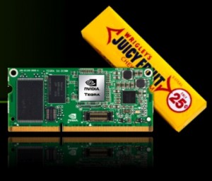
I saw a photo this morning that impressed me in a good sense. Nvidia is showing off their new really small computer on a really small circuit board. Here is there photo.
This is a gorgeous photo. Look at the reflection of the circuit board on the table. Look at the colors. Wow!
This is excellent communication in an image. I know how big the circuit board is. I can relate to the pack of gum. And see how the pack of gum adds to the image in other ways. It points upwards (hint, you systems can go up as well). The color brightens the image with yellow, red, and white.
Please everybody – take note of this. Use similar principles in your photos of products.
This photo belongs to Nvidia. I copied it from a CNET News story about Nvidia’s new system. I don’t think Nvidia minds me for showing this and advertising their product. I don’t think CNET News minds me for advertising their fine web site of technology news.

0 responses so far ↓
There are no comments yet...Kick things off by filling out the form below.
Leave a Comment